


Rebrand: Office Depot
In this class assignment, I had to rebrand Office Depot. I started by researching and identifying the key problems that come before jumping into sketches; As a business model, there is nothing wrong with how Office Depot operates. In fact, at the time of this project, they were doing quite well! That said I shifted over to their visual identity and found a few problems, especially when compared to its competitor, Staples. Both brands utilize an eye-catching red, and a clunky sort of typeface in white. Office Depot in particular looks especially dated with the clumsy serifs; I was pretty sure no one had touched the brand in years.
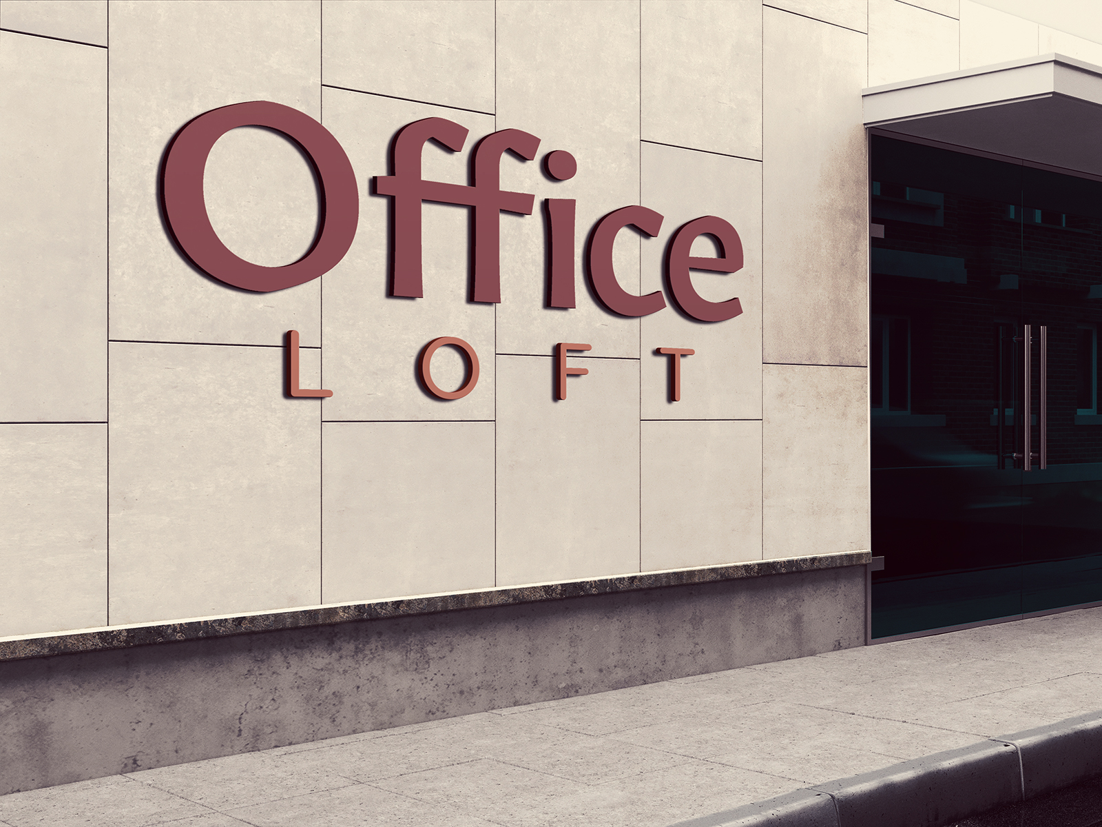
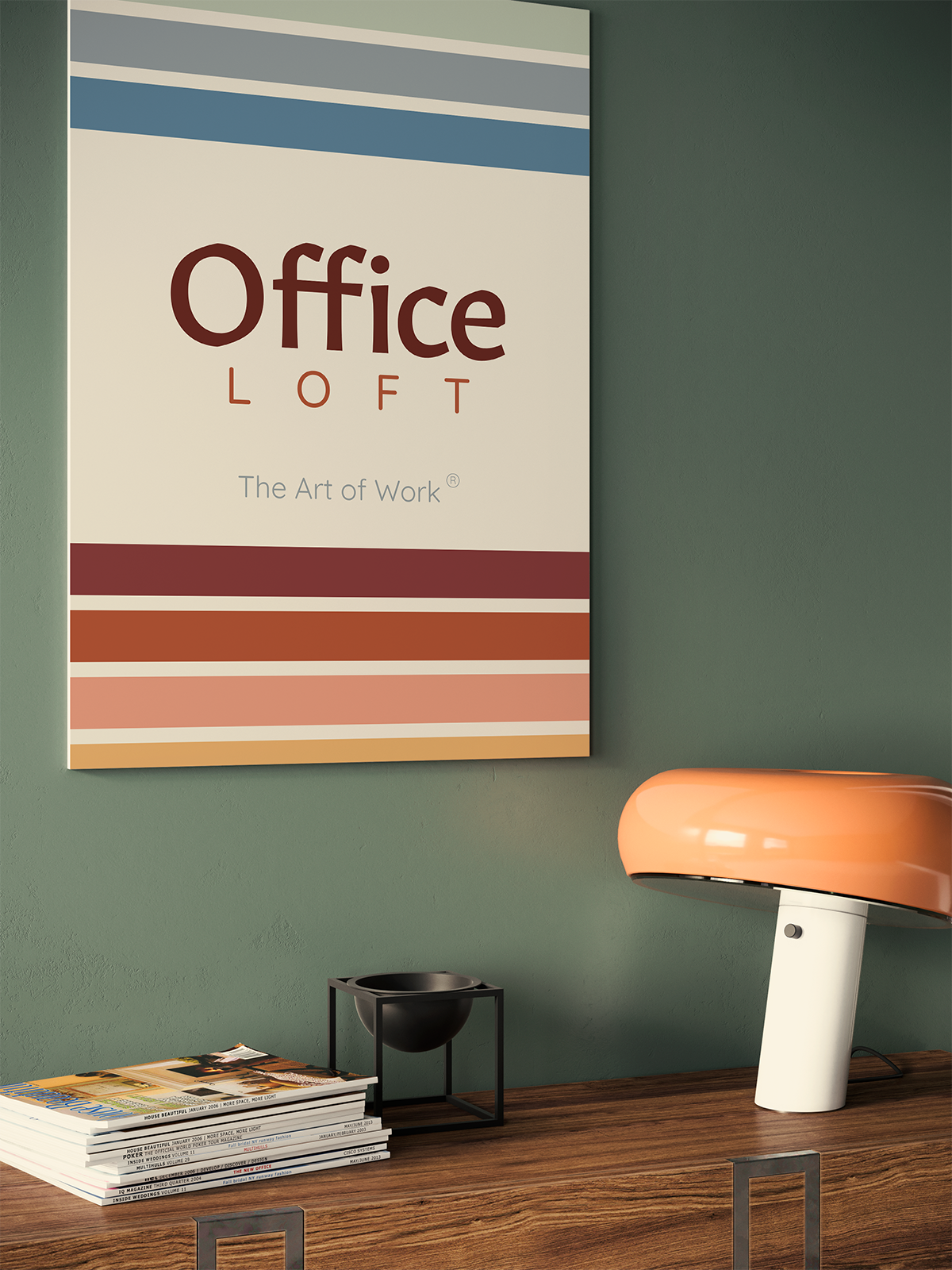
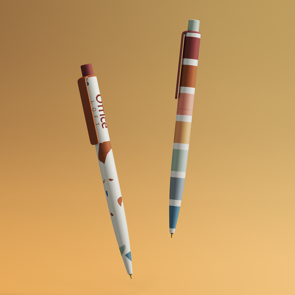
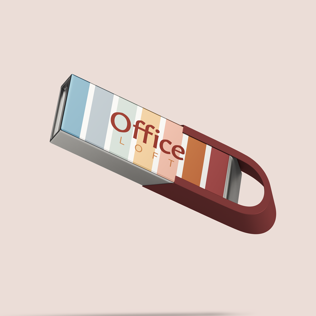
After research, I decided that I wanted to take the office supply store in an entirely new direction. Everyone knows that part of the fun of shopping for office supplies is choosing fun, quirky, but sophisticated objects. So how about an updated product line that are designed by historic, up and coming or local visual artists? Another idea I had was to introduce a shared workspace annexed to a coffee shop, so that customers could have a place to work, and a reason to stay longer, which leads to more shopping. Finally, I knew that I wanted a more simple typographical solution to the logo, so that I could let any patterns from the merchandise shine. After sketching, I thought it would be a delightful homage to the original identity if I could find a serif that "could be the cousin of the original". Thus, Office Loft was born!
Brand positioning statement: Office Loft is for anyone with a workspace who wants thoughtfully designed supplies for a dynamic productivity experience. unlike Staples, Office Loft is the only brand offering elevated collections of office supplies designed by artists by all walks of life because we like to get things done in style.
Tagline or Brandline: "Office Loft; The Art of Work"