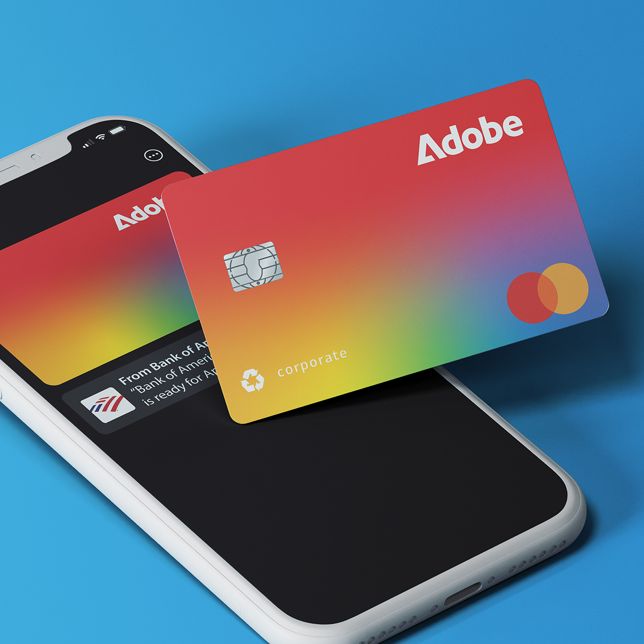
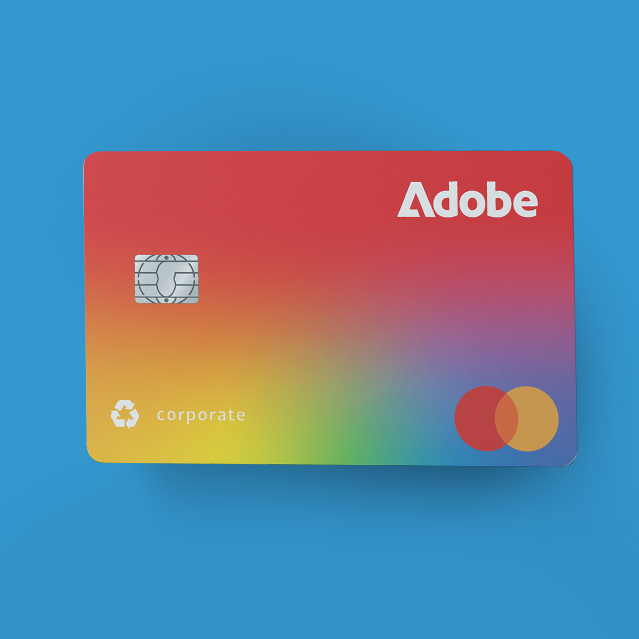
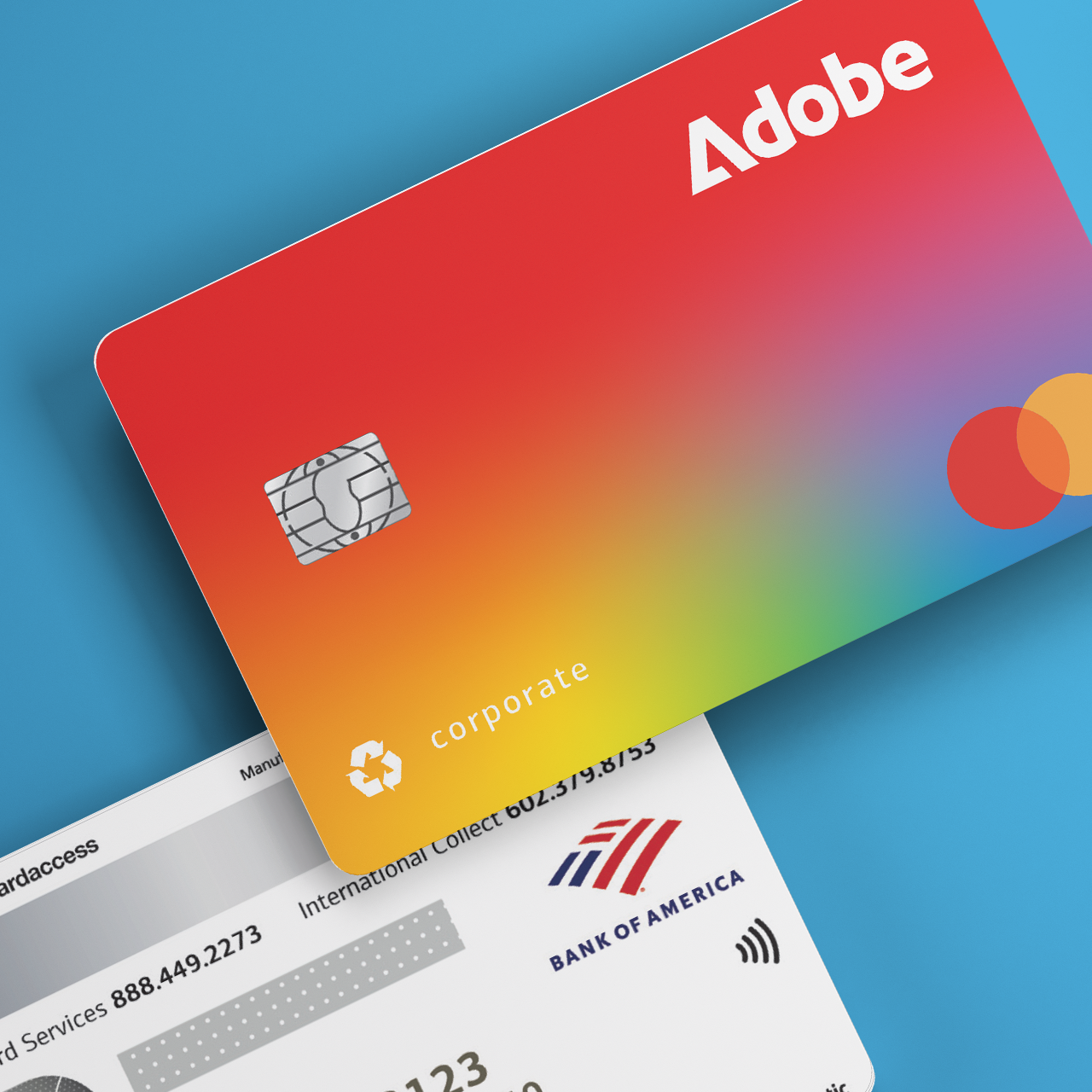
Corporate Card Refresh
I've had a lot of opportunity to contribute to various touchpoints as Adobe goes through their brand refresh. Due to a certain global event, The majority of those touchpoints were digital, so it was exciting to design something I could theoretically hold.
The design constraints with this project were the use of sustainable and recyclable materials. This eliminated anything with PMS or other speciality colors, or textures, or even UV/holographic spot mattes/glosses. (In one word... Disappointing.) How do I then design a credit card that is unique, and instantly recognizable as 'Adobe'? We went through many fabulous ideas which is always the best part; the process, not the final result. Suddenly, the creative director wants red with a bold type treatment, and the stakeholders want "a pop of color". -You know how it goes. The people-pleaser in me was pining for a solution that would, well, please everyone. I recalled a previous project (coming soon: Creative Grounds) where in the initial stages of research, I blended Adobe's proprietary Creative Cloud Gradient with their signature red. It was well-received but didn't work for the the purposes of that project. I decided to use it on the card- and it worked! This technique of blending the gradient to red was later adopted by other projects so... That's my legacy at Adobe!
For the duration of this project- and I still do not understand it- the stakeholders never asked us to make the logo bigger.