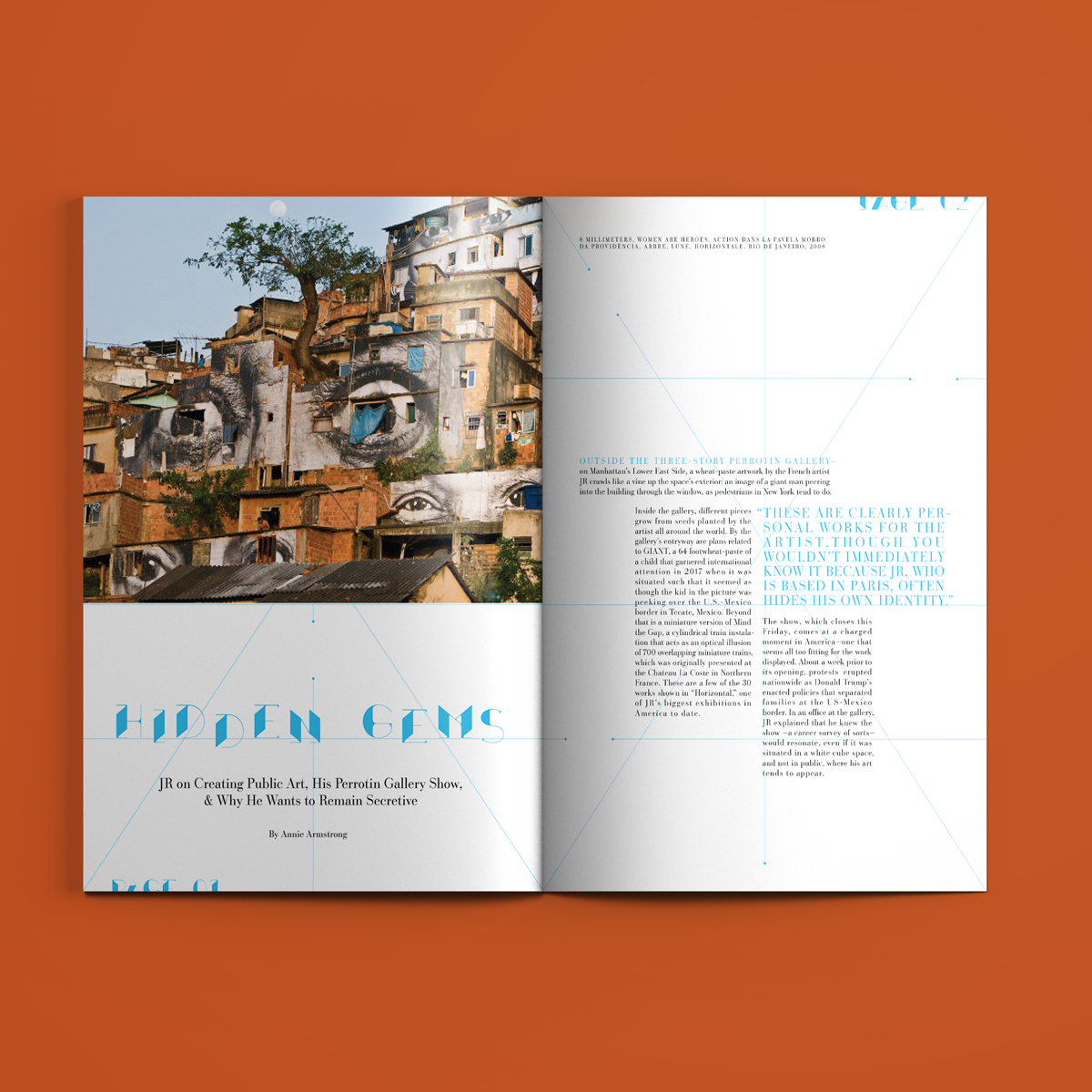
Hidden Gems
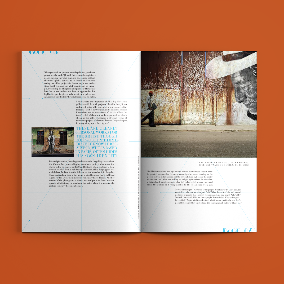
This magazine spread was originally for an Advanced Typography class I took at CSUN. The assignment stressed the relationship between the way type lays on a page, and its corresponding imagery. So for my main copy, I turned each paragraph into perfectly justified blocks that mimic the jaunty buildings in the first spread.
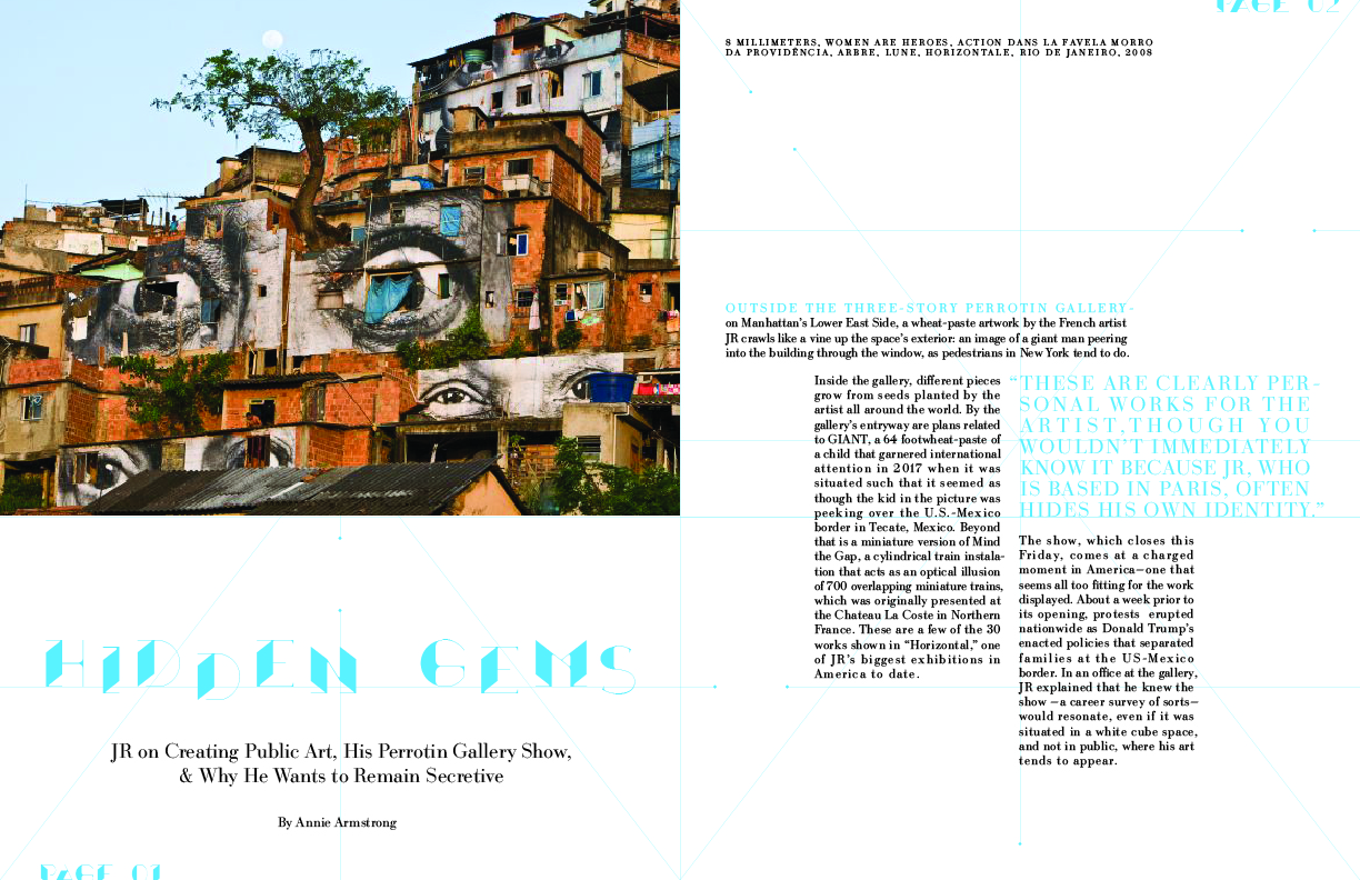
The content of the article is about the secretive artist J.R. who puts his art up all around buildings in the city of Rio de Janiro; Hence the use of the architectural display typeface.